A new hat!
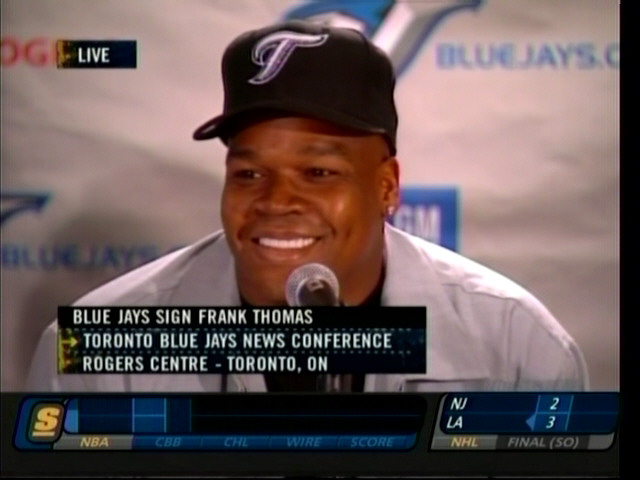
Well the Toronto Blue Jays are unveiling a new hat today at the Frank Thomas press conference! It's a black hat with a scripted "T" in the gray/blue scheme. This hat will most probably replace the grey hat that the team stopped wearing last year. A pic of the new hat (and new DH) to the right..News from the press conference:
- They came to terms with Gregg Zaun at "midnight last night", he "was the first choice all along"
- Overbay gave up his number and Thomas said "he'd do something special for him". Thomas enjoyed his convo with Lyle and mentioned that Lyle was considering going back to number 11
- No payroll yet, or at least they won't reveal it
Now look at this jersey, it was suggested that we should compare the T's...and sure enough the T from the Toronto in the jersey does not match the T on the hat. So hopefully the hat won't be worn with the jersey that says Toronto and only with the Black 'Jays' jersey. I can't believe they did not use the same script....And confirmation from the star that the Jays will no longer wear their grey caps and will alternate between the black hats. Godfrey was quoted as saying that the fans and players like them most.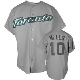
- Late day update...The Yanks have won the rights to the second Japanese pitcher to hit the market, paying $25 million.
11 comments:
wow...ugly! This is so basic and so much empty space. It better be a Sunday afternoon hat or somethingggggg
Not a bad hat. I'd rather see the Jays logo on a blue cap.
Frank Thomas looks like Dr. Dre kinda...ain't nothin but a g thang...but an ugly hat!
I like the hat! Represent! I'd like to see if the T on the jersey is the same...
I'm gonna try to find a good jersey pic to post on the site to do a comparsion, good call!
The big hurt, and zaun. Good. NOW GET AN ARM! They can move a SS to the bottom of the list because of Thomas's bat
The comparison is posted, sure enough the T's are not the same! Seems shady!
Nothing wrong with different fonts/styles on hats and jerseys.
Hell, we've been following that Detroit "D" long enough, and that has a subtle charm to it. However, the Olde English "D" has charm, whereas these uniforms do not.
Anyways, good to see Thomas in TO and glad to have Zaun back. Zaun/Phillips should be a good duo BHP.
Yeh I know there's nothing wrong, I just find it's a stupid look! Stuff should match not only colors but fonts also...oh well.
At least they didn't change the whole color schemes. Big Hurt looks good both in the hat and in the lineup :)
I just hope he's still smiling at the end of the season!
Post a Comment